breadcrumb
The Top 5 Color Palettes of December
This is the first collection of the top five color palettes of month. Bellow is the collection of December. Every color palette has a compination of colors and her own modern, fresh and unique style. Feel free and use them in your next design project!
GoldFish

The goldfish color palette features both cool and warm colors. Orange color is often associated with energy, balance, and creativity. In our case, what’s more, energetic than these two complementary tones of an orange color? The light green color and pear blue colors balance the color palette, creating a fresh feel.
Crystal Landscape
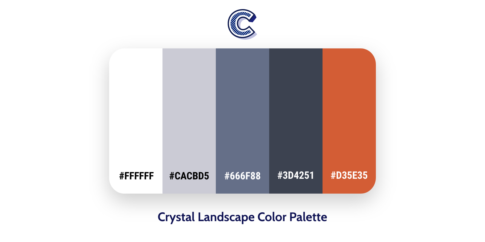
The Crystal Landscape color palette features some warm grays with cool. The tones of dark grayish blue color make a dynamic color scheme. The addition of orange color, along with the different shades of dark blue, gives this combination a little extra interesting on this palette.
Leaf
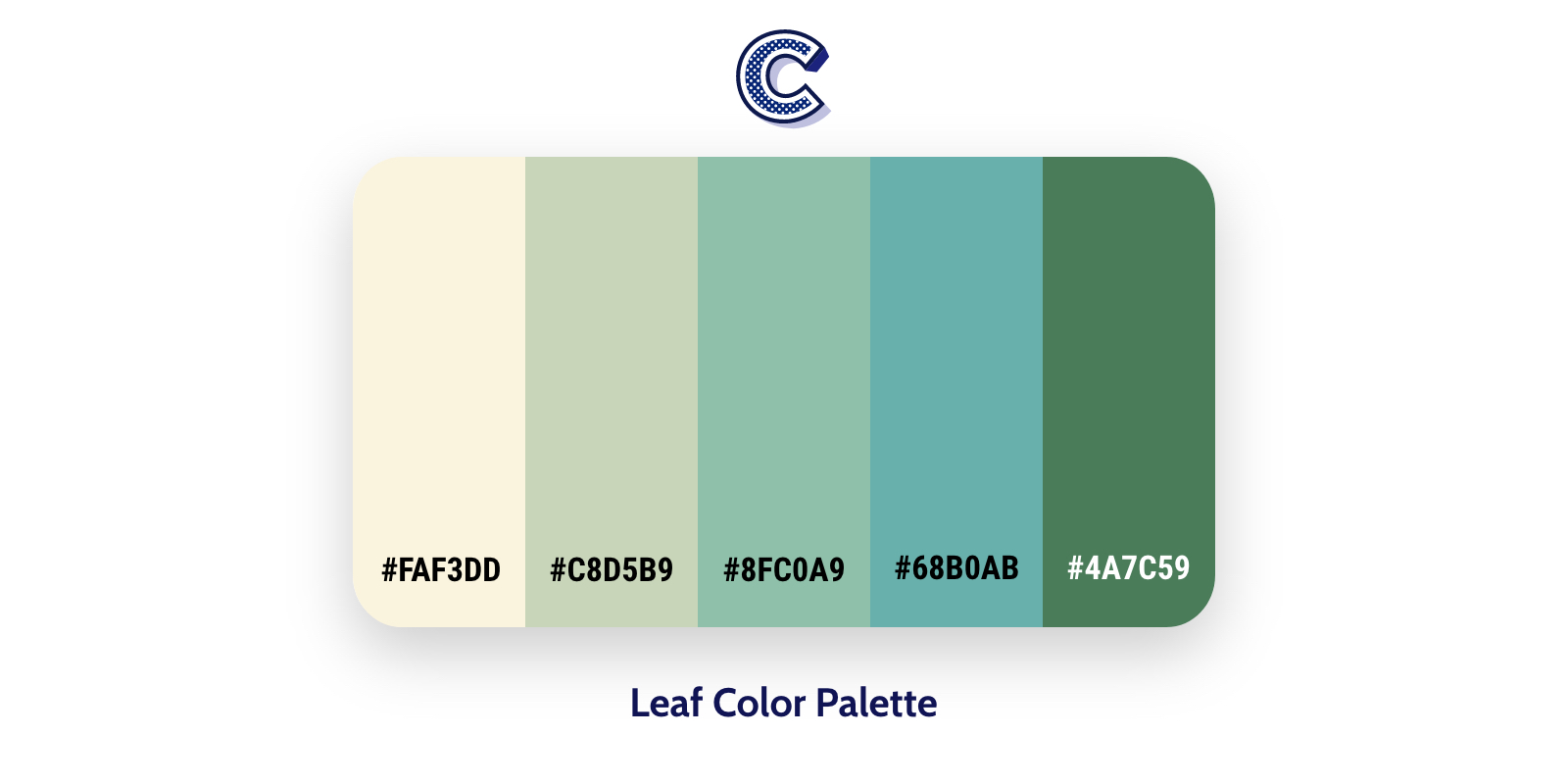
The monochromatic color schemes are extremely versatile. In our case, the leaf is a monochromatic color scheme. Leaf color scheme has a based color, the green color. The green color associated with health, nature, freshness, and the environment. This combination of the color palette could be used on environmental “green” products, tourism, etc.
Flux
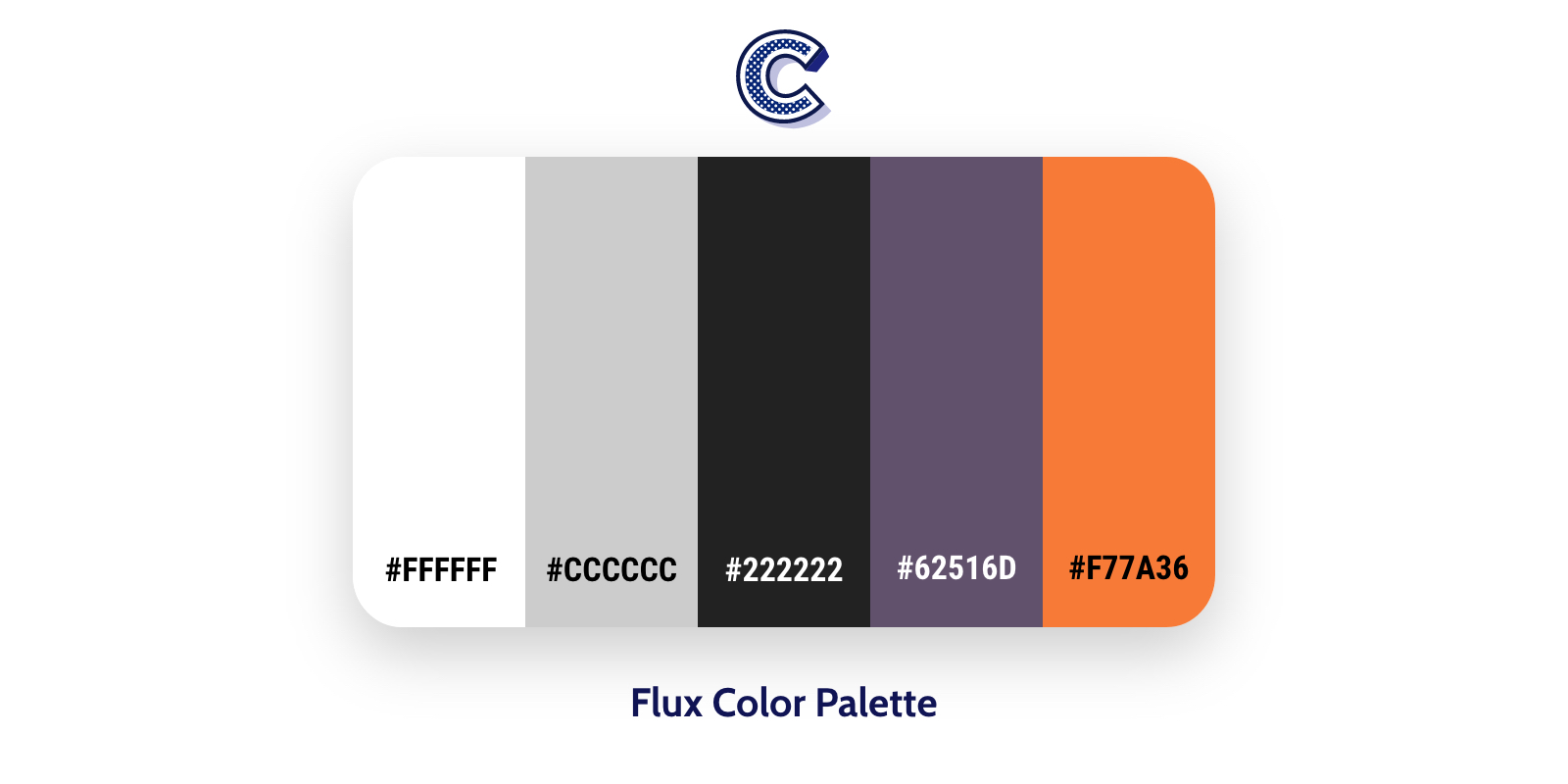
The flux color palette has five different colors. White, gray, black, purple and orange. This palette using one of the common combinations. In our case, white, gray and black, are always acceptable, usable colors. In fact, this type of color scheme seems easy to apply in your design and could work for a lot of design styles.
Persious
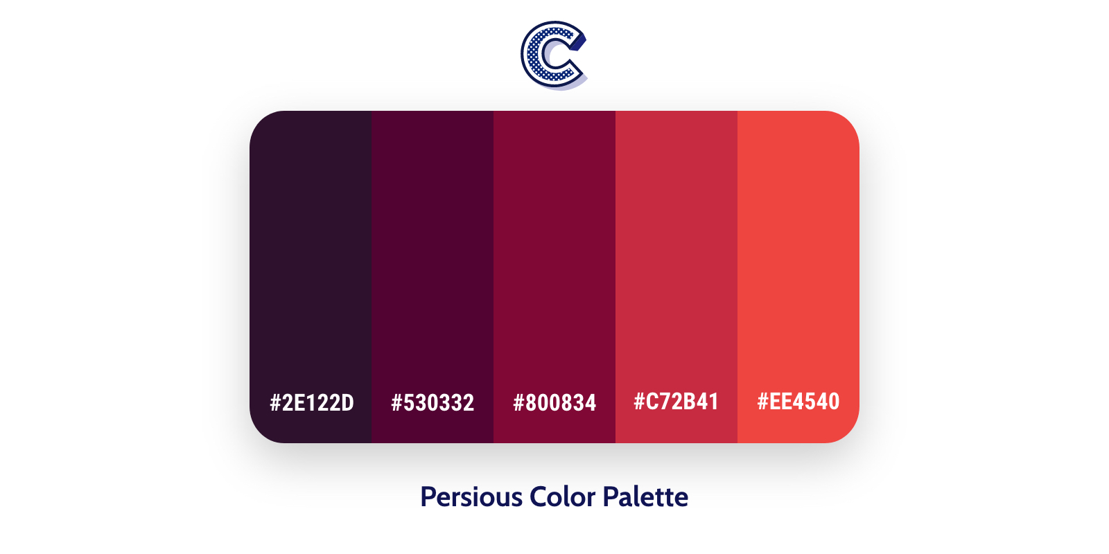
The Persious is another one monochromatic color scheme. The shades of red, give an impression that invokes a strong emotion and in detail, it is easily noticeable. On the other hand, the warm tones of orange associated to increase positive thinking and creativity.